Mac OS System 7 outlines vs HTML
Tree views on the web 2022-05-24 #UX

- System 7 buttons
- System 7 menus
- System 7 inputs
- System 7 outlines
This article continues a series on Mac OS’ 1991 System 7 user interface, as described in Apple’s 1992 edition of the Macintosh Human Interface Guidelines (HIG).
The last System 7 user-interface control in this series did not generally appear in Mac OS applications, but had an essential function for browsing files in Finder.
Outline triangle
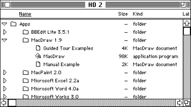
Outline triangles provide a way to expand and collapse sections of a hierarchy. System 7 used them in Finder windows to expand folders in the list view, shown here on the far left of the window content area:

HIG has little to say about outline triangles, other than to mention that the triangle rotates when clicked, rather than one icon replacing another. HIG only refers to using outline triangles in the Finder, specifically ‘next to folders’, and neither describes correct usage or using them to reveal anything other than folder contents.
HTML tree navigation
HTML forms have never had any kind of interactive outline, hierarchical browser, or tree control. HTML does, however, let you represent a hierarchy with nested details/summary blocks. You can use this to render the list with outline triangles.
This basic example features clickable nested list items, and the corresponding outline triangles.
Apps
BBEdit Lite 3.5.1
MacDraw 1.9
Guided Tour Examples
MacDraw
Manual Example
Mac Paint 2.0
Microsoft Excel 2.2a
Microsoft Word 4.0a
Microsoft Works 3.0
This kind of basic implementation, with only a little CSS, may look okay. However, it has problems.
Usability and accessibility
The basic HTML outline triangles above lack accessibility features found in both native web browser form controls, and the System 7 original. In Safari on macOS, there is some keyboard control, using Tab and Shift-Tab to navigate up and down, and Return or Enter to open/close each item.
In the modern macOS equivalent, you can use the keyboard’s arrow keys to navigate up and down the list of files and folders, and use the left and right arrows to close and open the selected folder, respectively. Keyboard control also lets you select an item by typing its initial letters (not limited to just one letter).
Cost
Web developers tend to avoid browser-native implementations, such as this one using details/summary elements, in favour of custom implementations. However, this kind of user-interface control has more behaviour than developers can easily identify, leading to custom implementations’ bugs and limitations. They don’t come cheap either, especially if you build your own instead of finding a reusable component and accepting its limitations.
In the end, this kind of outline selector might cost too much to make them worthwhile, especially given the difficulty of making hierarchical selection usable. After all, despite the ubiquity of tree controls in Microsoft Windows, Apple has never used them much. In the end, HTML doesn’t need this user-interface control, and doesn’t lose any points.
Screenshot from PCE.js MacPlus emulator

