Truncate content according to context
When omitting the end of text that doesn’t fit doesn’t work 2022-05-31 #UX

- The fridge door test
- Text truncation ←
- Text contrast
- Text size
- White space
When your software user interface displays variable length text, you have to decide what to do when you get longer text than you expected. You can:
- expand the area the text uses, possibly moving other user-interface components
- add a scroll bar, or other user-interface control for viewing the whole text
- truncate the text, typically by showing an ellipsis after a fixed initial length.
Designers often choose the easy third option, truncating the text. This saves the layout, but often at the cost of user experience, when people can no longer identify items or discover the complete text.
macOS file names
On macOS, Finder window file name columns omit the middle of a file name that doesn’t fit. Apple’s 1992 edition of the Macintosh Human Interface Guidelines explains:
… it’s best to eliminate text in the middle of the name and insert ellipsis points there, preserving the beginning and ending of the item’s name.
Users often add version numbers to the end of their document or device names, so if you cut off the end of the text item, they lose that context and must guess which of the several item names that begin the same is the desired one.
Similarly, people sometimes prefix calendar event titles, such as with [BLOCKER], or add categories to titles, such as the department name in Marketing - Q2 objectives. When the designer didn’t anticipate the additions, the text might not fit the user-interface design.
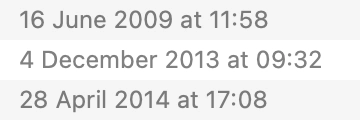
macOS date formatting
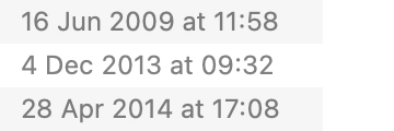
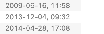
macOS Finder’s window date columns provide a more dynamic example, automatically switching date format length by direct manipulation, as you drag to make the column narrower.
The long format uses the full month name:
The medium format abbreviates the month name:
The short format only uses numbers:
Finally, the shortest format omits the time, reducing precision:

Meanwhile, the user’s system preferences define the specific formats that Finder uses, with independent choices of date part order, date part format, and date part separator:
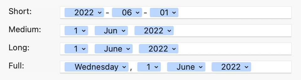
With most software, however, you can count yourself lucky if you can at least choose a regional language that changes the date separators and date part order, let alone making these independently configurable.
Context matters
Consider addresses. Should you prefer saving space by removing the city and country names from the end, or the street and house number from the start? It depends on which part has most importance in the context.
Similarly, if your user interface allows someone to browse items by name, don’t truncate those names to make space for less important information, like Mural does when browsing boards. When browsing my recently opened boards, only a third of them have titles short enough to appear in full. Even in Mural’s own documentation the first three example Recently opened murals have names that don’t fit.
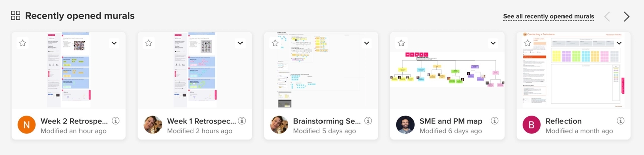
At least they changed Retrospective - week 2 to Week 2 Retrospective to avoid two indistinguishable titles. Meanwhile, the board thumbnail gets 14 times as much space, which looks pretty but results in a terrible user experience. Especially when similar titles coincide with similar looking boards, built from the same template.

