Mac OS System 7 buttons vs HTML
Browser-native user-interface controls compared to Mac OS 31 years ago 2022-05-03 #UX
- System 7 buttons
- System 7 menus
- System 7 inputs
- System 7 outlines
Apple’s Macintosh Human Interface Guidelines (HIG, 1992) describe the Mac OS’ 1991 System 7 user interface. In the same year, Tim Berners-Lee first published HTML Tags, the first public description of HTML. Mac OS System 7 included standard user-interface controls and HTML 2.0 added form controls in 1995, whose buttons remain nearly as good as System 7’s. But not quite.
Button
Buttons offer perhaps the simplest graphical user interface interaction, for performing or cancelling actions.
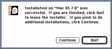
System 7 featured both a plain button and an emphasised default button - Continue and Quit, respectively in this example. HIG also specifies that the button highlights when clicked.
HTML form submit buttons lack a way to indicate a default button, leaving this to CSS styling. Unforunately, styling a button, e.g. changing only the text and background colours as in this example, reverts its style to a bevelled CSS default that no longer matches operating system buttons. This includes a different highlight style when you click the button.
In contemporary design systems, default buttons typically have a solid highlight colour, often blue. Unfortunately, having to completely restyle the button leads to every design system using its own button styles. Perhaps this also explains the modern trend to restyle every web-based form control, as part of an application-specific design system, instead leaving users with their familiar operating system style.
Radio button
Radio buttons offer a single selection from several options, named after old car radios, which had mutually-exclusive pop-out buttons.
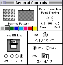
System 7 radio buttons only had a single representation, but could use horizontal or vertical layout for buttons and labels, as in this example. HIG recommends radio buttons for ‘two to approximately seven items’, and also notes that radio buttons should ‘never initiate an action’.
HTML radio buttons have become less fashionable in recent years, possibly as more modern button types have taken their place. Or maybe because designers prefer a menu’s more predictable layout. This ignores radio buttons’ benefits of making the options more visible, and enabling single-click selection.
Checkbox
Checkboxes allow multiple selection, like boxes on a paper form that you check off (tick in British English).
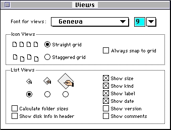
System 7 checkboxes (e.g. Always snap to grid) could have icons as well as text labels. HIG notes that designers may find it difficult to label checkbox:
The label should imply two clearly opposite states. […] With radio buttons, you can use two labels clarifying the states. It’s sometimes tempting to use a checkbox because one item takes us less space than two. However, the resulting item may be ambiguous and thus difficult for your users to understand.
These difficulties apply equally to modern user interfaces.
HTML checkboxes match exactly, and more often retain their default appearance in modern design systems. However, some design systems avoid checkboxes in favour of a single style for both radio buttons and checkboxes, indicating single vs multiple selection differently. Meanwhile, macOS and web user interfaces now use an additional button types, such as switches.
The score so far
Despite making a good start with HTML 2.0 forms in 1995, HTML buttons have not caught up with Mac OS. With no default button semantics, HTML only scores 2½ out of 3, compared to System 7 buttons, radio buttons and checkboxes. Perhaps HTML menus score better against System 7.
Screenshots from GUIdebook: Graphical User Interface gallery.

