Mac OS System 7 inputs vs HTML
Browser-native user-interface controls compared to Mac OS 31 years ago 2022-05-17 #UX

- System 7 buttons
- System 7 menus
- System 7 inputs
- System 7 outlines
This article continues a short series on Mac OS’ 1991 System 7 user interface, as described in Apple’s 1992 edition of the Macintosh Human Interface Guidelines (HIG).
This instalment looks at inputs - controls for entering g data. Let’s compare HTML inputs to what System 7 offered 31 years ago.
Text entry field
The text entry field provides the simplest support for typed-in values. System 7 offered a plain box for entering unstyled text:

The HTML 2.0 text input works the same way:
So far, so unremarkable.
Slider
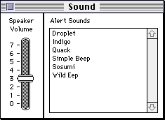
The slider replaces numeric input when the range is small or exact values do not matter. System 7’s slider included tick marks and labels:

HIG warns not to use a scroll bar ‘when you really mean to use a slider’, because that ‘confuses the meaning of the element and makes the interface inconsistent’. These days, however, we probably have too few scrollbars rather than too many.
HTML added a range input type that renders as a slider. At the time of writing, not all browsers support vertical orientation, tick marks and labels (0-7 in this example).
HIG advises to ‘include meaningful labels that indicate to users the range and direction of the slider’. Missing labels cause usability problems when users don’t find it obvious what up or right means.
Little arrows
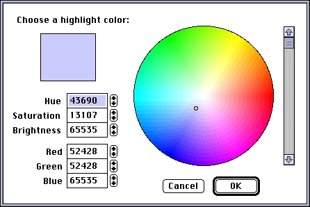
The adorably-named little arrows add fine control to numeric text input fields, so you can make small adjustments with the mouse instead of entering a new value. System 7 used a combined button for these arrows, as in this colour picker’s colour values:

As with the slider, HIG warns about situations when the user won’t find the direction obvious, and recommends ‘some indication what the user can expect by using the up arrow and the down arrow’.
The HTML number input works the same way, with the same rendering in modern browsers.
So far, HTML inputs more or less match what System 7 offered. For inputs, at least, HTML offers more.
Colour
HTML now has a color input that renders a native colour picker in supported browsers:
Colour selection in applications, as in GitLab’s label configuration, doesn’t use browser-native colour pickers yet.
Date and time
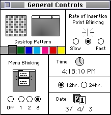
While most software doesn’t include colour pickers, it seems like all software includes at least one date picker. System 7 didn’t include a date picker. This control panel, for example, merely has three text inputs for the ‘date’ 3/4/3 at the bottom-right.

HTML, however, now offers both date and time-of-day inputs, separate or combined:
I would struggle to justify building a custom date picker, now that modern browsers provide their own. They appeared recently, though, so who can say whether developers will eventually adopt them instead of their own implementations.
System 7 vs HTML
HTML scores 2½ out of three for the first three controls, losing half a point for slider labels’ poor browser support. 1½ bonus points for colour (less useful) and date/time inputs increase that to 4 out of 3.
Screenshots from GUIdebook: Graphical User Interface gallery.

