Mac OS System 7 menus vs HTML
Browser-native user-interface controls compared to Mac OS 31 years ago 2022-05-10 #UX

- System 7 buttons
- System 7 menus
- System 7 inputs
- System 7 outlines
This article continues a short series on Mac OS’ 1991 System 7 user interface, as described in Apple’s 1992 edition of the Macintosh Human Interface Guidelines (HIG).
This instalment looks at menus - controls for selecting things from lists. Let’s compare HTML menus to what System 7 offered 31 years ago.
Pop-up menu
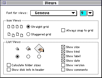
Pop-up menus (called dropdown menus in Windows) provide an alternative to radio buttons, for single selection, that use less screen space. System 7 uses a black shadow to make pop-up menus pop, as in this dialogue’s Font for views menu:

Unlike the flat system 7 buttons, this design foreshadows three-dimensional effects for user-interface controls in later Mac OS user interfaces.
HIG recommends pop-up menus for 5-12 items, and ‘when the user doesn’t need to see all the choices at the same time’. HIG adds:
… use the same font for the closed state and the open state of a pop-up menu. If the menu looks different when it’s open, you destroy the illusion that it is one object that expands and contracts.
HTML 2.0 added the equivalent select menu in 1995:
Select menus often include many items: think countries rather than months. Despite this, it took years for HTML to offer text input with autocomplete.
Type-in pop-up menu
Type-in pop-up menus (combo boxes in Windows) allow the user to enter a value that the list does not already include. System 7 implemented this with a pop-up next to a text input, as in the Font for views font size:

HIG characterises the type-in pop-up menu as a variant of the pop-up menu, rather than as a kind of text input:
… all preset choices should be visible so that people can make choices with mouse actions. The type-in option should be an additional choice when appropriate, not a requirement.
Fifteen years after HTML 2.0, HTML5 datalists add suggested values to text inputs:
The HTML version auto-completes values as the user types, which makes it useful for long lists. However, after entering a value, such as 9, the list no longer offers its pre-defined options for selection with the mouse, as HIG required for System 7.
Modern browsers barely support this variation, at the time of writing. Can I Use reports that Firefox and IE 11 still suffer from limitations.
Scrolling list
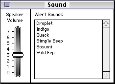
A scrolling list supports selection from a large number of items. System 7 used a list and a scroll bar, as for this dialogue’s Alert sounds list:

HIG notes that a scrolling list ‘can contain as many items as necessary’, rather than recommending limiting it to the pop-up menu’s dozen items.
HTML 2.0 renders a select menu as a scrolling list when you specify a vertical size:
Ironically, while System 7 displayed the scroll bar even when not necessary, macOS now only displays the scroll bar after the user has already started scrolling.
System 7 vs HTML
HTML only recently increased its score from two to three out of three points, for these three menu types. Sadly, HTML-native type-in pop-up menu adoption does not look promising, as web application developers now routinely implement their own versions. Each with slightly different behaviour.
Screenshots from GUIdebook: Graphical User Interface gallery.

