Increase UI information density
resisting the decadence of minimalist user interfaces 2026-05-12 #UX #design
- The fridge door test
- Text truncation
- Text contrast
- Text size
- White space ←
When designers hate text, they elide, fade and shrink it. But most of all, they have as little as possible text on the screen, as if people can’t handle many words at the same time. I appreciate the sentiment, because we all suffer from overstimulation, but not because of insufficiently Zen user interfaces.
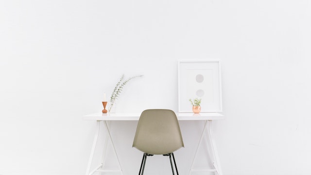
Gratuitous white space
The most basic text-avoidance technique uses generous white space around text elements. Like a laptop-sized coffee table book whose double-page spread features a single photo and a 5 × 5 cm text block, designers’ favourite user interfaces reserve most of the viewport area for negative space.
Fashion doesn’t drive design any more or less than the rest of the tech industry, but when designers cater to the designer’s gaze, the words lose out to the spaces. Above all, user-interface fashion design victims lust after a ‘clean’ user-interface, devoid of dirty text.
Misplaced minimalism
Discarding text in favour of white space leads to user-interface minimalism, where scroll bars remain invisible until you expose them for long enough to grab on to. Minimalism reduces art to its essentials. Misplaced minimalism misplaces those essentials.
These misplaced efforts to avoid content fail to acknowledge user interfaces that exist primarily to share and process information. Hiding the user-interface controls only emphasises the content if you don’t reduce the number of pixels you actually devote to that content.
Edward Tufte
In The Visual Display of Quantitative Information, Edward Tufte celebrates high-resolution tables, charts and other graphics that convey more information in a smaller area. Increasing the information density enables human analysis, not only simplified conclusions. He writes about the data-ink ratio – adding information-carrying ‘ink’ to the page, and removing what does not represent data.
Tufte’s ideas translate well to software user-interfaces, where pixels take over ink’s print design role. Moreover, software frequently exists to make complex information findable, presentable and palatable.
Nouvelle cuisine
In the 1960s nouvelle cuisine brought a kind of minimalism to French cooking, with simpler and lighter dishes, compared to previous generations’ complicated dishes and menus. Similarly, contemporary user-interface design has responded to past excesses, and simplified its metaphorical menus.
Nouvelle cuisine doesn’t always go down well, though: not everyone appreciates its pretension, its price, and going home still hungry. And when designers hate text, a badly-designed user experience equally serves too little information to satisfy us.
Rejecting decadence
I challenge designers to avoid the lure of ‘clean’ design, minimalism, and decadence in design. Instead, I hope they take inspiration from Tufte, beautiful representations of complex data, and sophisticated layout and typography of text. Because if they don’t, nothing will defend us from a regressive backlash, namely the new trend for brutalist text-based user interfaces.

