Use high-contrast colours for text
The fashionable grey text design horror 2024-03-19 #design

- The fridge door test
- Text truncation
- Text contrast ←
- Text size
- White space
User-interface design follows fashion as much as any other field, such as product management or programming. Visual trends like skeuomorphism and flat design come and go, and every change updates and refreshes old designs. But some trends also degrade user experience.
Grey body text
For a decade or more, fashionable web design has favoured grey text on a white background over black text.
For example, this blog post paragraph uses dark grey (#5b5a59) body text on a white background
(source):
Lighter text colours de-emphasise text on the page, perhaps in favour of other elements. While this text appears reasonably legible, the rationale for this aesthetic remains obscure. Designers sometimes claim that too much contrast causes eye strain, despite an apparent lack of evidence. Meanwhile, web accessibility standards recommend the opposite.
Legible text contrast
The W3C Web Content Accessibility Guidelines (WCAG) include a distinguishable text guideline, which includes two text contrast success criteria:
- minimum (level AA) - a contrast ratio of at least 4.5:1, or 3:1 for large text (at least 18 pt, or 14 pt bold)
- enhanced (level AAA) - a contrast ratio of at least 7:1, or 4.5:1 for large text (at least 18 pt, or 14 pt bold)
It doesn’t matter if you don’t have an intuition for how much contrast that is, because you can use an online or tool-based contrast checker.
For example, in the gray text example above, the Cycle blog paragraph uses #5b5a59 colour text on a white background: contrast ratio 6.9:1.
This meets the minimum (AA) contrast standard, but narrowly fails to satisfy enhanced contrast (AAA).
Some web sites fail even to use minimum-contrast body text (source):
This paragraph uses light grey (#959FB4) text on a white background: contrast ratio 2.7.
Tiny grey hint text
Another popular design idiom uses tiny grey text for hints and inline help. This Linear example uses both grey body text (left), and tiny grey text (right), to describe milestones, documents and links.
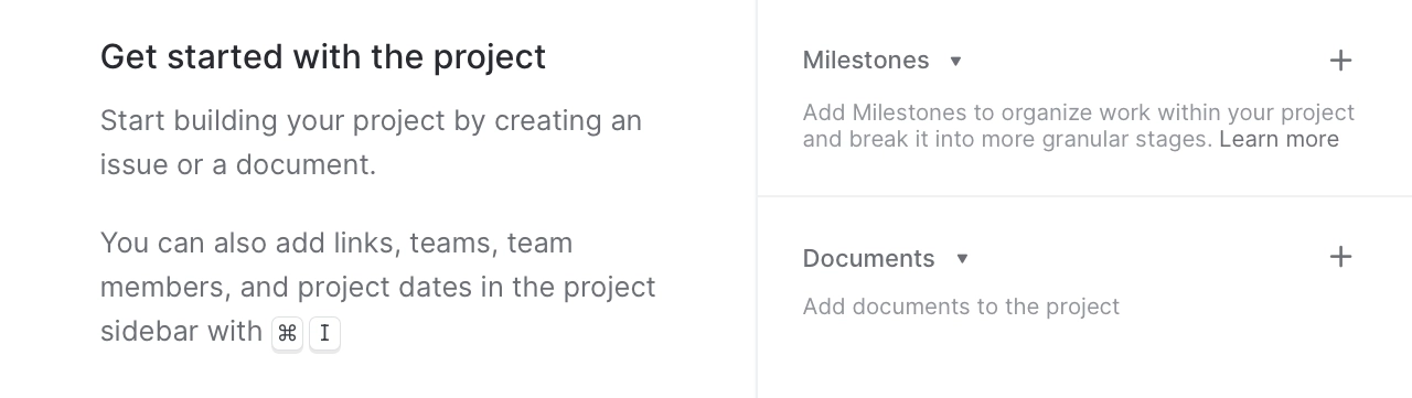
The hint text uses grey (#90959D) on white: contrast ratio 3:1.
That reaches only the minimum (AA) contrast for large text, failing to achieve usable contrast for small text.
This common design treats hint text like some kind of deliberately unusable disabled user interface element. This has less of a negative impact than the same low contrast for body text, because you only have to read it once, and may appreciate its subtlety when you no longer need it. However, the tiny size makes it less legible, which evens things out.
Dark mode hint text
Tiny grey hint text also makes some dark mode designs hard to use. In this Duolingo example, a less-familiar alphabet make things worse:
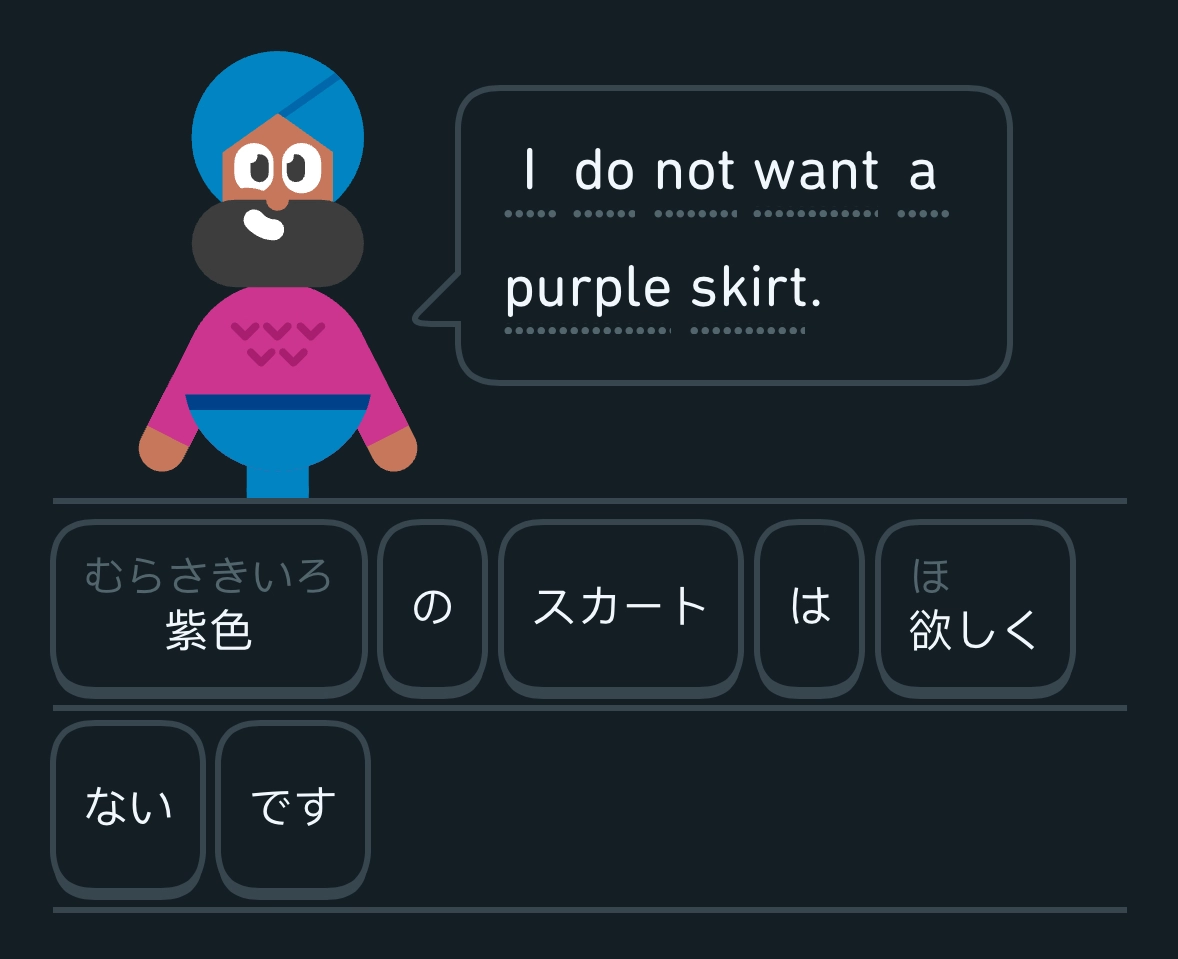
The むらさきいろ hint (bottom-left) gives the pronunciation (murasakiiro) of 紫色 - Japanese for purple.
This hint text uses light grey (#52656C) on dark grey (#141F25): contrast ratio 2.7.
The worst text contrast
I recently found an even worse example, when searching the Brave browser settings for a way to manually trigger a version upgrade check. It turns out that you have to click the apparently-disabled About Brave navigation option:
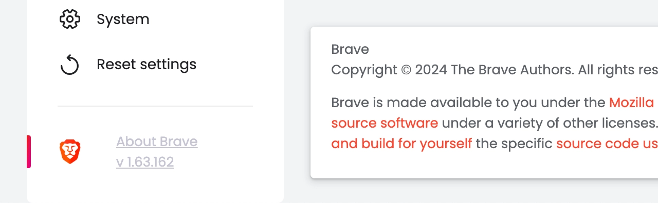
This menu item (bottom-left) uses light grey (#C5C5D3) on white: contrast ratio 1.7:1.
I don’t know what the designer was trying to achieve here, but
low-contrast text is not the answer.

