Ugly code and typography
Why good code still looks bad 60 years on 2020-09-15 #programming
Written version of part of Beautiful code: typography and visual programming (2017-2018)
When programmers think about beautiful code, we think about writing style, not what it actually looks like. Programmers have always failed to make code more visually appealing with better type. Not type as in type system, but type as in typewriter. After all, when we read code, it tends to look like it came out of a typewriter.
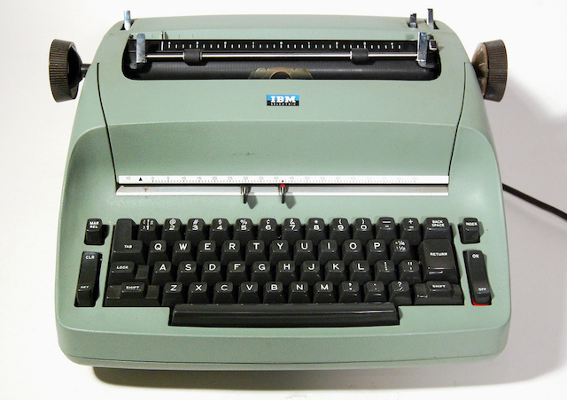
This 1961 IBM Selectric typewriter had a choice of 45 typefaces that you could select by changing its ‘golf ball’ type head:
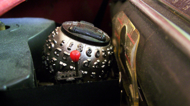
Dominika Komender CC BY-ND 2.0
These typefaces included IBM’s newly commissioned ‘Courier’. Did source code take advantage of this new technology? No, it did not.
While typewriter typography advanced, source code typography didn’t exist in the 60s and 70s. Courier would later become important for source code, but for years we printed COBOL and FORTRAN on line printers. Line printers optimised for printing speed. From a typographical perspective, they made code look primitive and ugly:
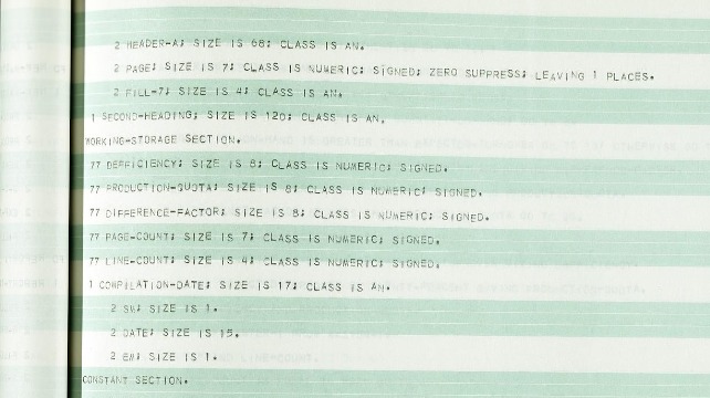
National Museum of American History Smithsonian Institution CC BY-NC 2.0
First steps in source code typography
Source code got a new look in 1992, when Windows 3.1 introduced Courier New, which became a standard monospace font, still widely used for source code. Courier New’s lighter font weight gives it thinner lines that render better on low-resolution displays than Courier:
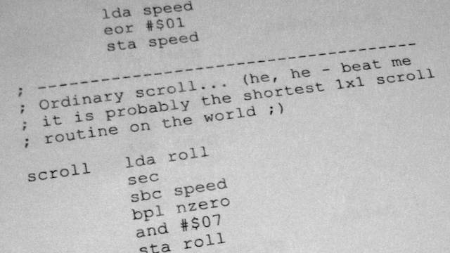
Since the exciting introduction of Courier New, source code typography innovation has brought us more than just new typefaces. The following code snippet illustrates the 21st century’s first innovations: syntax colour, bold, and italic.
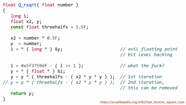
This example uses Consolas, a new typeface that Microsoft introduced along with several other font families with an initial ‘C’ to take advantage of its new LCD font rendering technology in 2004. Consolas’ improved legibility no doubt offered the most important benefit to programmers, but it also helps that it looks better than Courier New.
Ligatures on the cutting edge
More recently, many new programming fonts might ennoble our code if we used them more. They includes hipster commercial fonts like Pragmata Pro, as well as mainstream open-source fonts such as Inconsolata (a Consolas clone), Liberation Mono, Bitstream Vera Sans Mono, and recent fonts such as JetBrains Mono.
This recent typographical diversity may only result from programmers’ love of tweaking their tools, beyond choosing the perfect syntax highlighting colour scheme with a dark background. Even so, it takes us a small step towards code with better type. The next step goes back as far as typography itself.
Ligatures combine letter pairs into larger glyphs that look better than the separate glyphs. Several new typefaces introduce ligatures for source code to coding fonts, starting with the Hasklig code font that Ian Tuomi developed for Haskell in 2012. Hasklig, Fira Code - a more general-purpose code font with ligatures, and JetBrains Mono, include several kinds of ligatures:
Innovations in source code typography
To summarise, 60 years of source code typography innovations:
- Courier typeface, commissioned by IBM (1955)
- Syntax highlighting - colour/bold (1985)
- Courier New, introduced with Windows 3.1 (1992)
- Consolas font, commissioned by Microsoft (2004)
- PragmataPro - peak hipster coding font (2010)
- Hasklig code font with ligatures, Ian Tuomi (2012)
Decades of progress merely consists of new typefaces, styled characters, and ligatures. We could have so much more.

