Source code layout
Why source code deserves layout as well as typography 2020-09-22 #programming
Written version of part of Beautiful code: typography and visual programming (2017-2018)
Of all of the text we read in our daily lives, source code looks the worst, not because of bad coding style but because of bad typography. Decades after we stopped using typewriters, only source usually looks like it came out of a typewriter. And it gets worse: code lacks more than just good typography.
Two-dimensional layout
Today, software developers have, or should have, large wide screen monitors. When these developers work on large legacy code bases, they spend lots of time reading source code files that have ‘too many lines’ - hundreds or thousands. Source code files typically have a tall and narrow shape - a completely different shape to the monitor you read it on.
Modern monitors often have a 16:9 aspect ratio, while a 5000-line class with 120 characters per line has an aspect ration of about 1:8.
This leads to integrated development environments with bento box user interfaces that only use a small portion of the available space for source code, and only show a small proportion of the code in that space. Programmers would get more value from multiple large monitors if more of each monitor showed source code. Sadly, the way we present and read source code pays no attention to layout.
Newspaper layout
One possible solution uses the horizontal space to flow the code into columns, and scroll sideways to view additional columns when the code still doesn’t fit on the screen. This approach risks making navigation harder, so we could make further improvements:
- a larger font size for method signatures
- horizontal and vertical lines to separate methods and columns
- top-level information in a ‘masthead’ at the top of the ‘page’
- a nice big font for the class name.
Once you’ve got that far, you might as well go all the way, and use a classic broadsheet newspaper layout, with a coat of arms and drop caps.
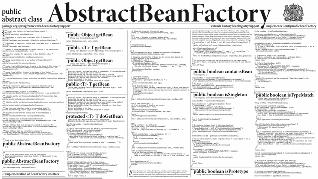
If we actually did this, and used development environments that presented code in a newspaper layout, it would start a revolution in programming tooling. However, we’d have only caught up with seventeenth century print design.
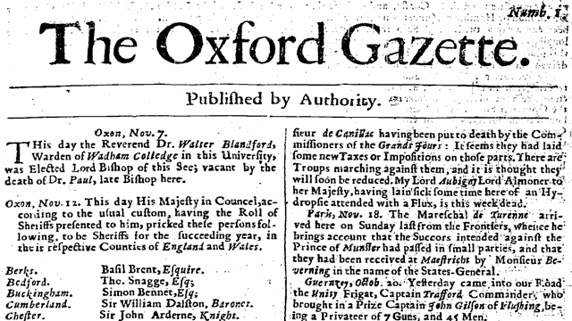
Two-dimensional layout with columns, separator lines and a masthead already appeared in the layout of the very first edition of The Oxford Gazette, the first newspaper published in England, on 7 November 1665. We need something more modern.
A thought experiment
People practised layout and typography long before anyone invented computers and programming. Even digital layout and typography date from the early 1980s - the start of the desktop publishing revolution.
To imagine what current approaches for layout and typography might do for source code, consider what the following might look like.
- Reference books and technical guides
- Thousands of pages (100,000 lines of code, corresponding to around one million ‘words’)
- Most of the content updated frequently
- Typical lifetime of five to ten years
Whatever that would look like, it certainly wouldn’t look like a novel - linear text in a single typeface and font size, structured only by paragraphs and chapters. Just imagine!

