Product review: Nuclino
a cheaper simpler European Notion alternative 2025-06-24 #product #review
Nuclino offers a European alternative to Notion, with less functionality for a lower price. At first, I missed Notion’s flexible structure, and Anytype’s fancy types and templates, but as I explored, Nuclino’s simpler structure and design grew on me.
Pages
Editing and commenting on a page (or selected text) works just like in Notion, but simpler. You can highlight text, for example, but can’t choose the highlight colour, or change text colour. Similarly, callouts give you five icon/colour combinations, such as a blue info callout:
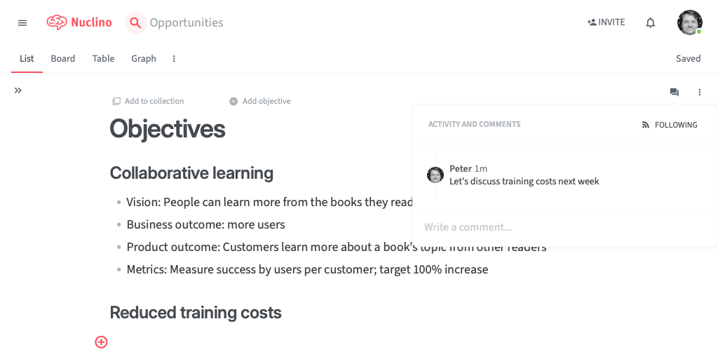
I like the monochrome-plus-red-highlight visual design, but not the tiny grey text (e.g. Add to collection).
Search
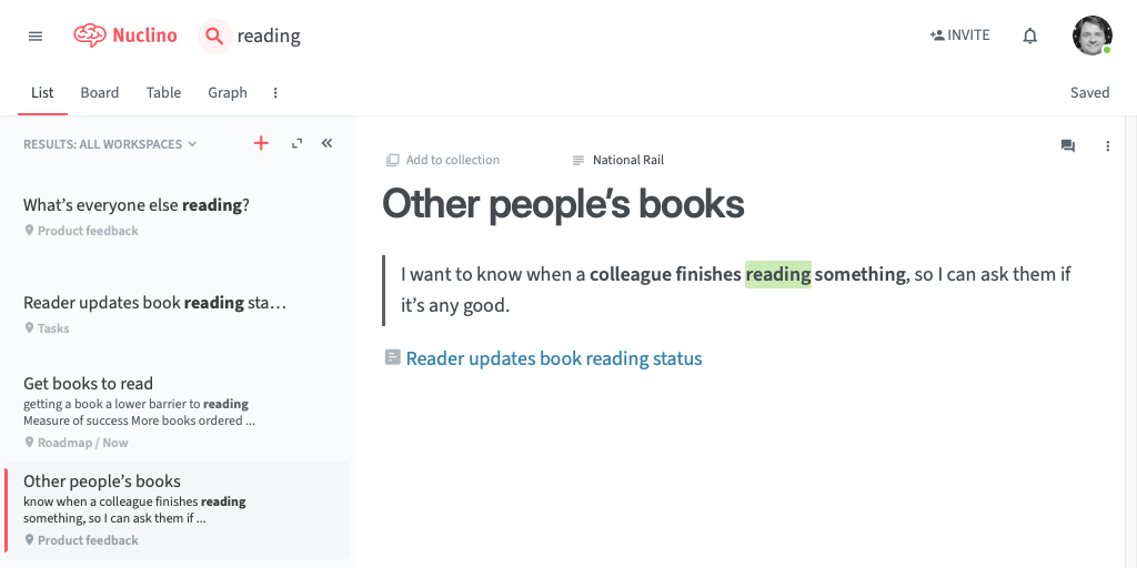
I like the search functionality, which lists search results in a left-hand sidebar, and shows the selected page on the right. Unlike many contemporary search interfaces, Nuclino actually shows the matched text in each result:
Views
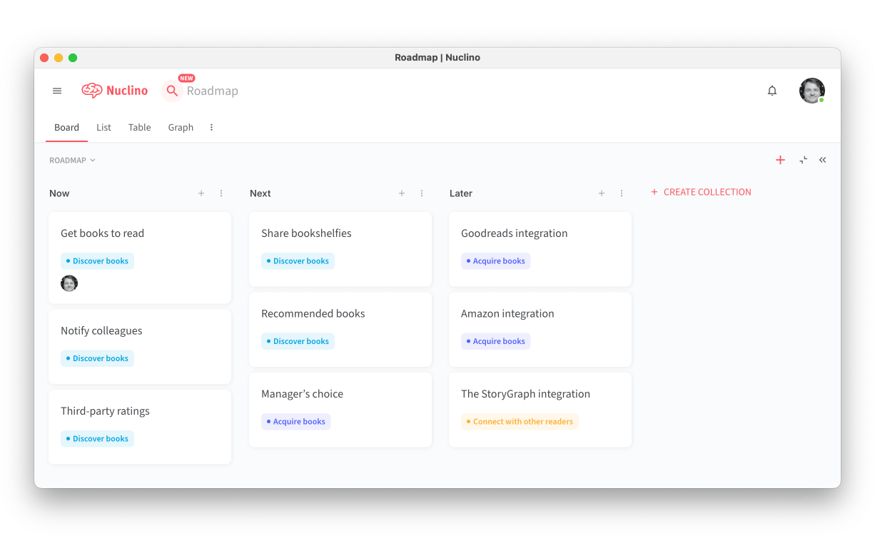
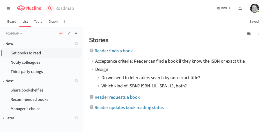
Each page (called an item) belongs to a workspace that, like a Notion database, has several views. The list view shows a hierarchy of collections, which organise pages.
The board view shows the same pages, with columns for the top-level collections. I appreciate the simplification of using the collection hierarchy like this, but it does feel strange to use this for a roadmap where the column doesn’s correspond to an opportunity’s status.
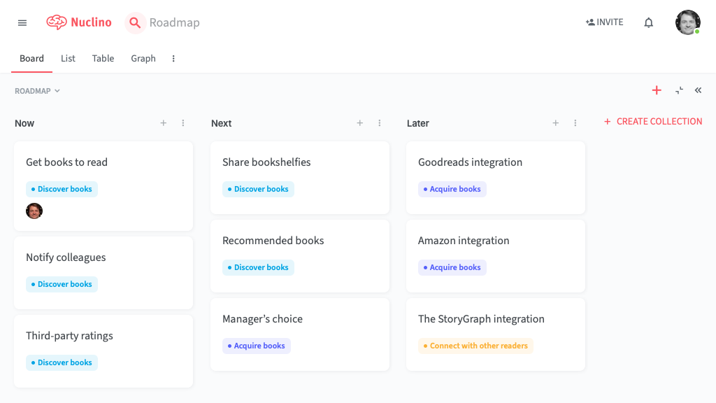
A workspace only has one board view, and without options to search or filter pages, I can only imagine using this for a short backlog.
Selecting a page in a view opens a split view, with slightly confusing icons to either close the page, or expand it to fill the whole width.
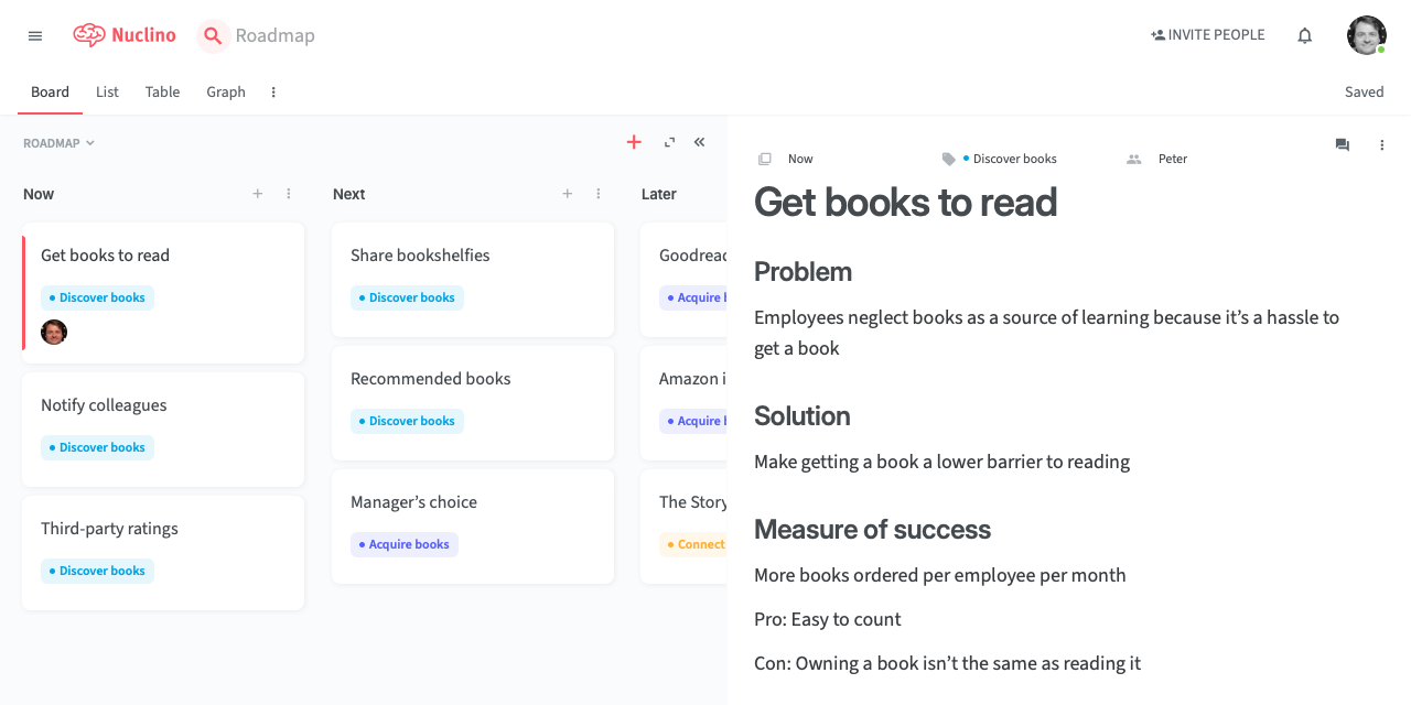
This example roadmap categorises each item with an opportunity, such as Discover books. To show this on each page, the workspace defines a custom opportunity field. This cleverly avoids the need to define page templates, with different fields, but does mean that all related pages (tasks, feedback, meetings, etc.) must each occupy their own workspace.
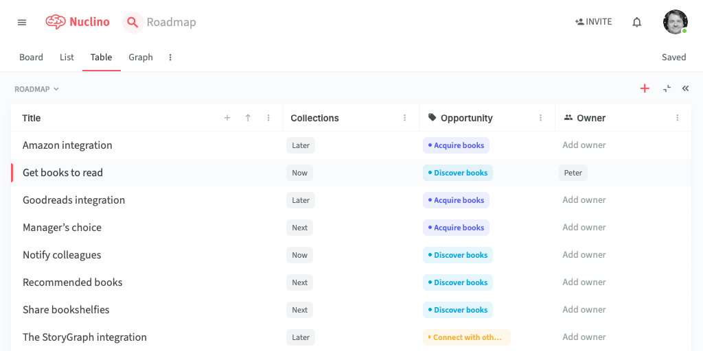
The table view becomes useful when the workspace defines several fields:
Graphical views
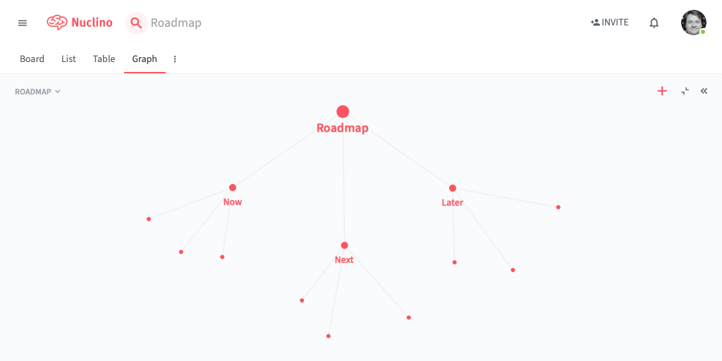
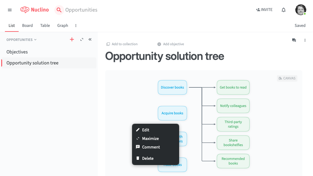
Each workspace also has a graph view, but this feels like a gimmick that looks pretty in demos. A useful graph view would let you control the layout, so you could use it as an opportunity solution tree, for example.
Fortunately, a built-in canvas tool makes up for the useless graph view. You can insert canvases as blocks in a page, for diagrams and virtual whiteboards:
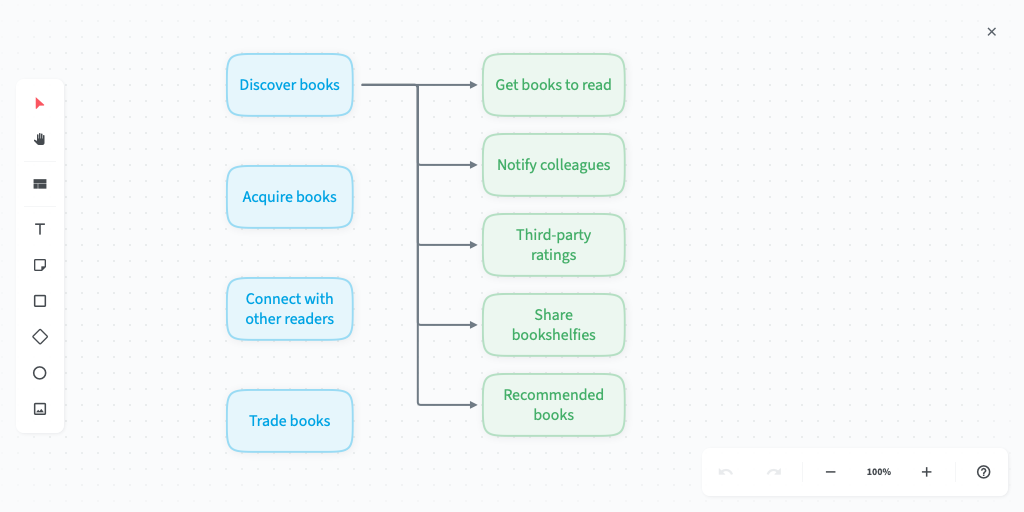
You edit a canvas in a full-page editor, which has the same simplicity as the rest of Nuclino. You get text, notes, shapes, images and connectors, and a fixed colour palette.
You can also add Mermaid diagrams to pages, along with other integrations.
The value of simplicity
I welcome Nuclino’s limited feature set, compared to more complex alternatives, because it avoids how they make you feel slightly lost. By contrast, Nuclino’s straightforward organisation and clear visual design make it feel immediately comfortable.
Nuclino looks like a great option for a small team that doesn’t need a more expensive collaboration tool. Now we just need a cheaper simpler European Slack alternative, to go with it.

