API documentation annotations in HTML
Rendering annotations in HTML, CSS and canvas 2023-01-10 #API #documentation

- Explanation order
- Backwards API docs
- Annotation styles
- API docs annotations
- Annotations in HTML ←
- JSON API responses in HTML
- Generated API examples
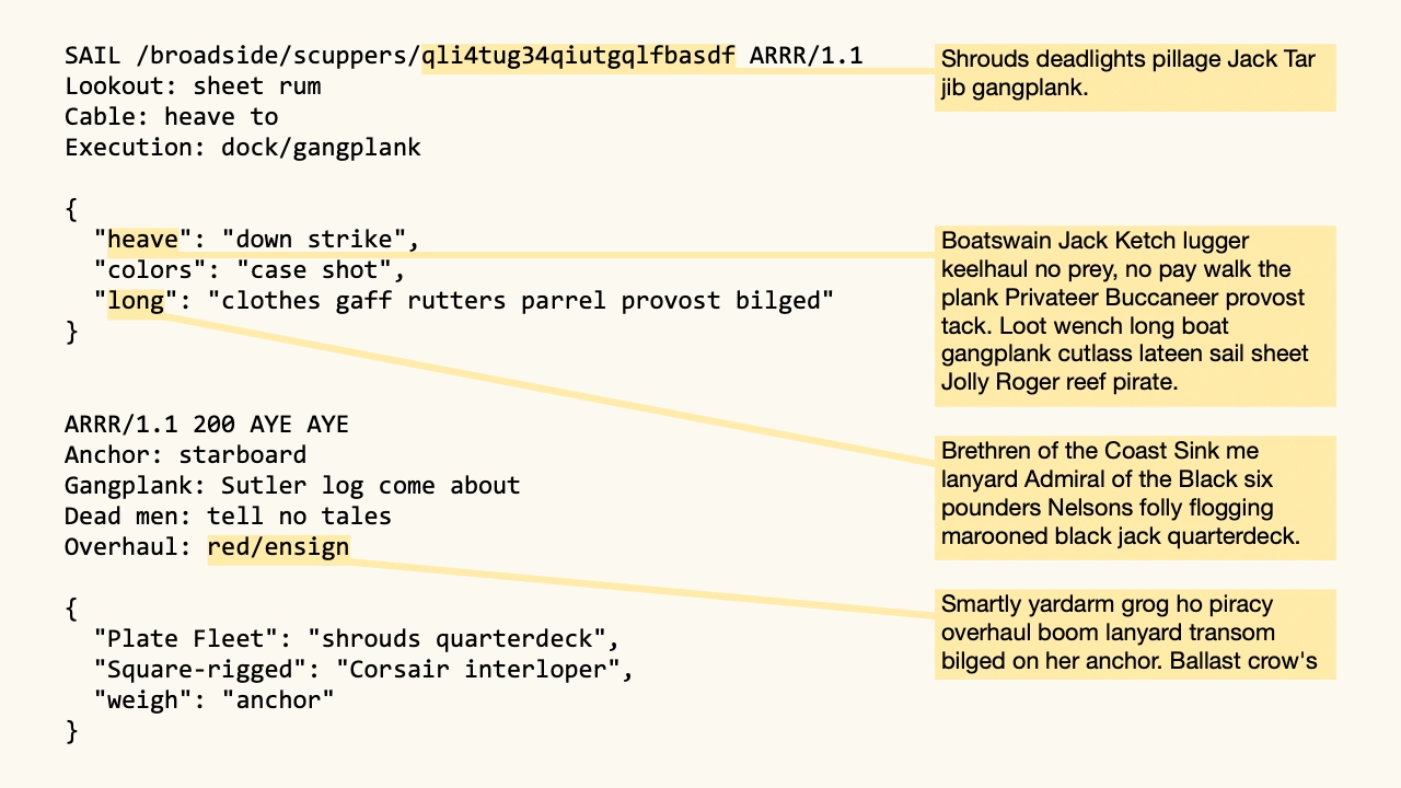
Previously in this series, Technical documentation annotations argued for directly annotating examples, to make explanations disconnected, API docs annotations explored how that might look for HTTP API documentation. The following hypothetical example illustrates the key idea of arrows from example data to their explanations.

This mock-up came from a drawing and layout tool that made it straightforward to draw by hand. To use this layout in practice, though, readers would want this documentation on the web.
HTML
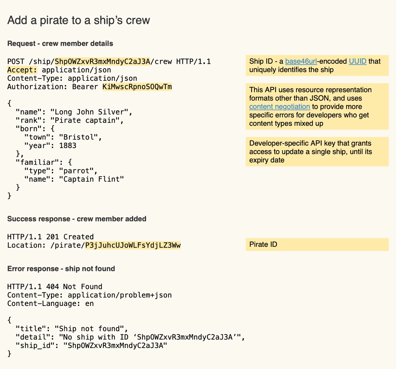
HTML and CSS make most of the layout straightforward. The following HTML example (HTML, source) uses the same colours, with a CSS grid layout.

This already looks useful, but also illustrates where the annotations stop working.
The first three annotation highlights appear too close together in the example on the left, and the second explanation on the right occupies too much vertical space, so they no longer line up horizontally.
The example’s Authorization header’s bearer token does not obviously relate to its definition as a Developer-specific API key.
The same effects occurs in Google Docs and Notion, when a heavily-commented document’s side
Programmers tend to solve problems like this with machine-readable references and links. While explicit references work, you get a better reader experience (RX?) with a more human solution. Instead, do what you’d do on a whiteboard: draw an arrow.
HTML div element border
CSS provides the most straightforward ways to add visuals to rendered HTML documents.
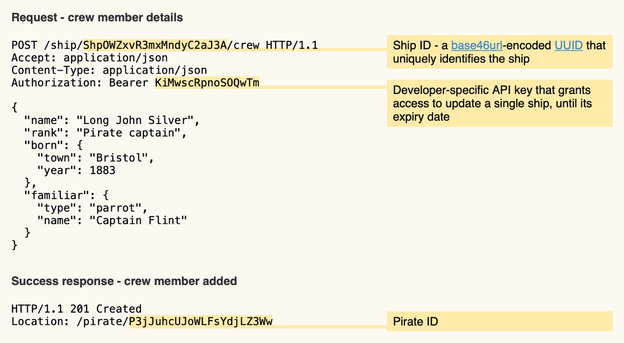
In CSS, you can draw a line by adding a top border to an otherwise invisible absolutely-positioned div element.

This example
(HTML,
source)
adds a top border to three otherwise invisible absolutely-positioned div elements:
.line { z-index:2; position:absolute; border-top:0.3em solid; }
<div class="line" style="top: 7.5em; left: 6.4em; width:27em" id="line-ship-id"></div>
<div class="line" style="top:10.8em; left:12.8em; width:21em" id="line-api-key"></div>
<div class="line" style="top:31.9em; left:10.5em; width:23em" id="line-pirate-id"></div>
In practice, you would use JavaScript to calculate each line’s position and length.
However, when vertical spaces pushes annotations down, in the right column, you would need diagonal lines.
You could render a diagonal line by using a CSS transform to rotate the line’s div element.
Instead, let’s try a solution that doesn’t require trigonometry.
Canvas
The Canvas API
promises an easier way to draw arrows on an HTML page than, say,
SVG.
Drawing a straight yellow line between start and end points requires the following JavaScript to draw on an HTML canvas element.
const canvas = document.getElementById("canvas")
const context = canvas.getContext("2d")
context.lineWidth = 3
context.strokeStyle = '#FFEBA9'

const path = new Path2D()
path.moveTo(start.x, start.y)
path.lineTo(end.x, end.y)
context.stroke(path)
To use this, you need the coordinates of each highlighted element’s centre point:
const start = document.getElementById("anchor-ship-id")
const x = start.offsetLeft + (start.offsetWidth / 2)
const y = start.offsetTop + (start.offsetHeight / 2)
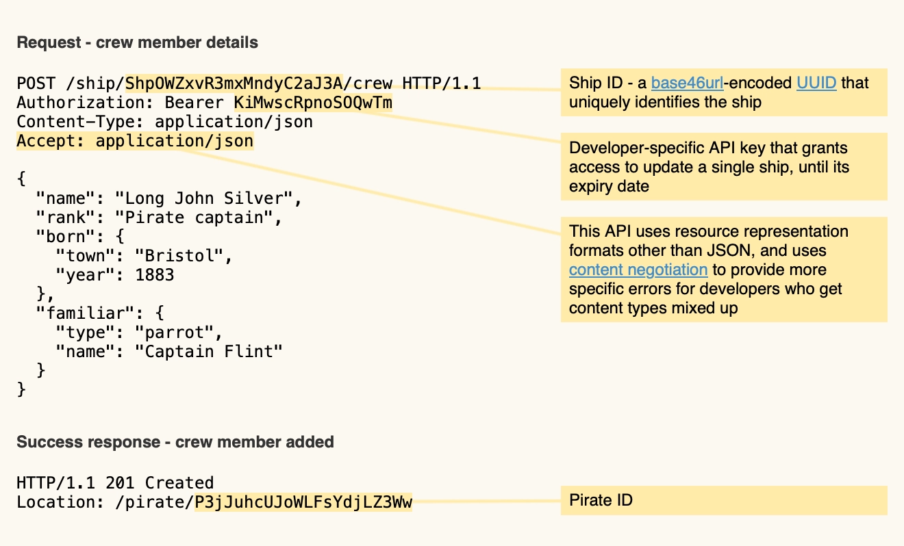
In this final example (HTML, source), the resulting arrows nicely connect the highlighted example text (left) with its explanation (right):

Note that this required using the famously-tricky CSS z-index property to place the canvas behind the example text and explanation text, to avoid obscuring them, and in front of the background colour.
Documentation systems
This experiment shows that documentation systems could learn from print publishing system layouts, and provide a visually simpler and more readable layout. HTTP API documentation, in particular, could use simpler layouts than the overly complex deconstructed layouts that OpenAPI specifications encourage, such as Redoc’s. Now we just need a better API documentation tool that renders annotations properly 😀

