CSS seating diagrams
changing problem framing for easier solutions 2026-11-17 #programming
Peter Hilton
Last week, I found myself producing choir rehearsal seating diagrams. I chose to do it the hard way, writing SVG by hand, to think more deeply about the solution. At the same time, I discovered a simpler way to think about the problem.
SVG seating diagram
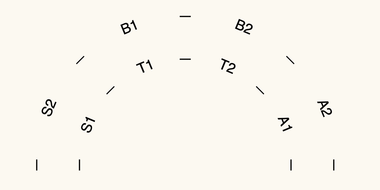
The final diagram indicates two rows of singers in an eight-part choir, split into SSAATTBB parts:
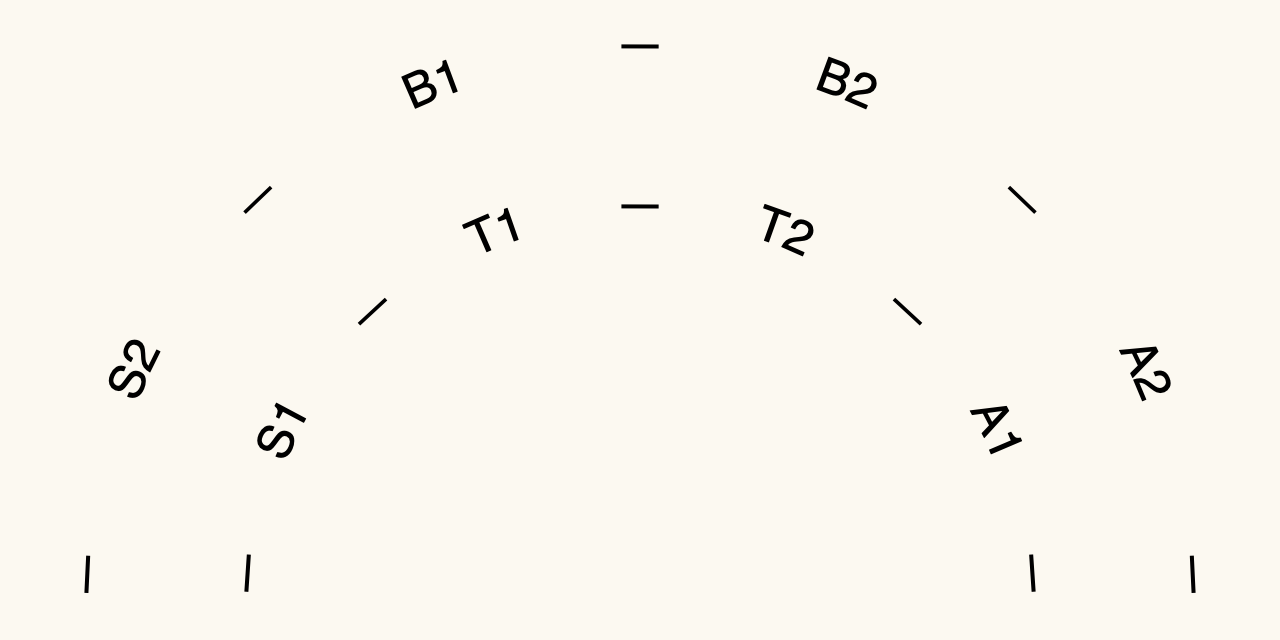
This uses the following CSS and SVG:
path { fill: transparent }
text { font: 24px sans-serif }
#back-row { word-spacing: 290%; }
#front-row { word-spacing: 160%; }
<svg viewBox="0 0 640 320" class="seating">
  <path d="M050,300  a 270 270  0 0 1  540,0" id="back"/>
  <path d="M130,300  a 190 190  0 0 1  380,0" id="front"/>
  <text text-anchor="middle">
    <textPath startOffset="50%" href="#back" id="back-row">
      — S2 — B1 — B2 — A2 —</textPath>
    <textPath startOffset="50%" href="#front" id="front-row">
      — S1 — T1 — T2 — A1 —</textPath>
  </text>
</svg>
This uses the SVG textPath to draw text along the curve of a semi-circle that a path draws.
It turns out that you can also think about the problem differently.
Rotating and moving chairs
Describing the seating layout as chairs arranged in a semi-circle introduces a virtual semi-circle. In reality, you only have chairs. Instead of arranging the chairs in a straight line, you arrange them so each singer in a row sits an equal distance from the conductor, which you can also think of rotating the chairs to face the conductor.
These days it feels like we have a first law of web development that states that you can probably do that with CSS. And indeed, although CSS can’t render text along a curved path, as far as I know, it can certainly rotate text.
Rotating and moving text
In CSS, you can use the transform property to rotate and translate (move) text. For example, consider the position and rotation of the numbers in the following diagram:
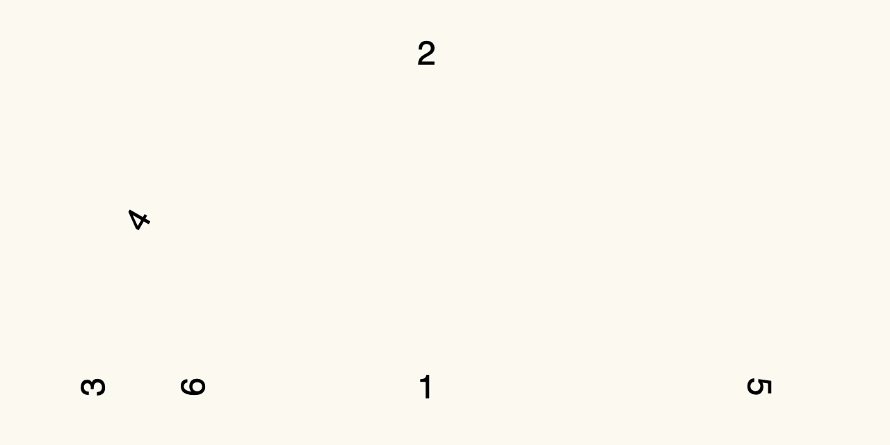
The numbers have the following positions:
- the origin (where the conductor stands)
- the origin, translated (moved) vertically
- the origin, translated, then rotated 90º left
- the origin, translated, rotated 90º left, then rotated 30º right
- the origin, translated, rotated 90º left, then rotated 180º right
- the origin, translated a shorter distance, then rotated 90º left
This uses the following HTML:
<div class="row">
<span class="c1">1</span>
<span class="c2">2</span>
<span class="c3">3</span>
<span class="c4">4</span>
<span class="c5">5</span>
<span class="c6">6</span>
</div>
And the following CSS:
.row span { top:11em; left: 300px; position:absolute; }
.c2 { transform: translateY(-10em); }
.c3 { transform: rotate(-90deg) translateY(-10em); }
.c4 { transform: rotate(calc(-90deg + 30deg)) translateY(-10em); }
.c5 { transform: rotate(calc(-90deg + 180deg)) translateY(-10em); }
.c6 { transform: rotate(calc(-90deg)) translateY(-7em); }
The span representing each chair has its own transformation that consists of a rotation, followed by a translation.
The order matters: if the transformation for chair 6 applied the translation before the rotation, the number 6 would appear below the 2:
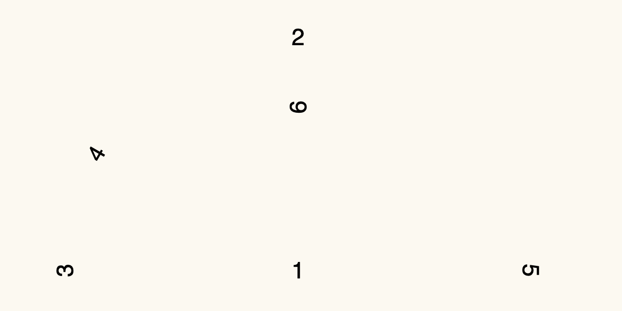
.c6 { transform: translateY(-7em) rotate(calc(-90deg)); }
Variable angles
We now have all of the ingredients to draw the final diagram. However, calculating the angles for eight voice parts, plus the dashes that represent additional chairs, would result in a lot of CSS transformation properties with different numbers.
CSS custom properties,
also known as CSS variables, give us a way to solve the problem.
For each span element, we can define an --index property to use instead of a class name:
<div class="back row">
<span style="--index: 0">—</span>
<span style="--index: 1">S2</span>
<span style="--index: 2">—</span>
<span style="--index: 3">B1</span>
<span style="--index: 4">—</span>
<span style="--index: 5">B2</span>
<span style="--index: 6">—</span>
<span style="--index: 7">A2</span>
<span style="--index: 8">—</span>
</div>
<div class="front row">
<span style="--index:0">—</span>
<span style="--index:1">S1</span>
<span style="--index:2">—</span>
<span style="--index:3">T1</span>
<span style="--index:4">—</span>
<span style="--index:5">T2</span>
<span style="--index:6">—</span>
<span style="--index:7">A1</span>
<span style="--index:8">—</span>
</div>
Next, we can use the sibling-count() function to count the number of gaps between span elements, and then calculate the number of degrees rotation for each gap:
.row span {
  --gapCount: calc(sibling-count() - 1);
  --gapAngle: 180deg / var(--gapCount);
}
Finally, we can use multiply this angle by the index to get the variable rotation for each span element:
.back.row span {
  transform:
    rotate(calc(-90deg + (var(--gapAngle) * var(--index))))
    translateY(-10em);
}
This gives the same result as the SVG version, with small differences in spacing. In particular, you can barely see (or care) that a label such as S1 has the letters on a short line segment instead of a short curve:
Problem framing
At first, I focused on semicircles that don’t appear in the final result, and thought I couldn’t draw this diagram with CSS. Thinking about positioning and rotating chairs revealed a simpler solution.
Software development tip: beware of product-manager solutions, and explore multiple approaches.

