Show content without elision
When perceived cleanliness trumps user experience 2022-03-22 #UX
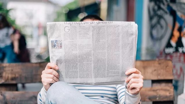
One of the quirks of newspaper design arises from the tension between fixed page size and variable article length. To solve the resulting layout puzzle, you vary the size of headlines and images, edit the article text to make it a few lines longer or shorter, and add pointless pull-out quotes. You end up with an irregular tessellation of articles, with different shapes and sizes.
Occasionally, the layout won’t fit, and you resort to text like continued on page 3 where you run out of space. Meanwhile in software, user-interface designers face similar layout puzzles.
Overview menus
In Stop the overuse of overflow menus, Daniel Burka explores the bad user experience caused by overview menus - ‘those obscure menu buttons on apps and websites that reveal even more menu options’. Burka blames two things, arguing first that designers don’t want UI cluttering up their UI:
Overflow menus are really enticing to user interface designers. It’s been drilled into designers’ heads for years that the pinnacle of achievement is a “clean” user interface.
He then goes on to blame a failure to reduce complexity for having too many menu items in the first place, before concluding that designers mistake obfuscation for simplification. By hiding the menu items that make the total too many, overflow menus address the symptom of too many options.
The challenge here lies in the interplay between two different problems: which menu items you have, and where to put them. Fortunately, the designer has the list of menu items in advance, a luxury you don’t get with user-generated content.
Text elision
Ludwig Wendzich explores another example of design-led obfuscation in Why you should never truncate in UI. He writes not about hiding menu items, but eliding (truncating) the end of a text phrase by replacing it with an ellipsis (the … character). He applies the following rule:
Respect our users’ content. Do not truncate words they type in.
Wendzich describes his team’s old ‘bad habit’ of eliding text to make user-interface elements ‘look nice’, and how they developed better approaches to making complex information visible.
By focusing on user content, Wendzich points at a harder problem than a failure to tame your own menu items. Your product’s functionality constrains the scope of designing your menu, but presenting someone’s postal address poses a harder problem. You cannot predict user content the same way as you can a menu structure, because you don’t know how much space that content requires.
Organic design
The worst design for a complex television remote control features a grid of many identical small buttons. These days, remote control design improves usability by embracing a more organic style, with varying sizes, shapes and colours, rather than trying to make it so clean. Software designs could benefit from a similar approach instead of gratuitously eliding content.
Meanwhile, I wonder how user-interface designers would approach newspaper design. No doubt the front pages would consist of a grid of equal-sized blocks, with continued at the bottom of every one. It might look tidy, perhaps even clean, but you’d end up with a terrible reader experience.

